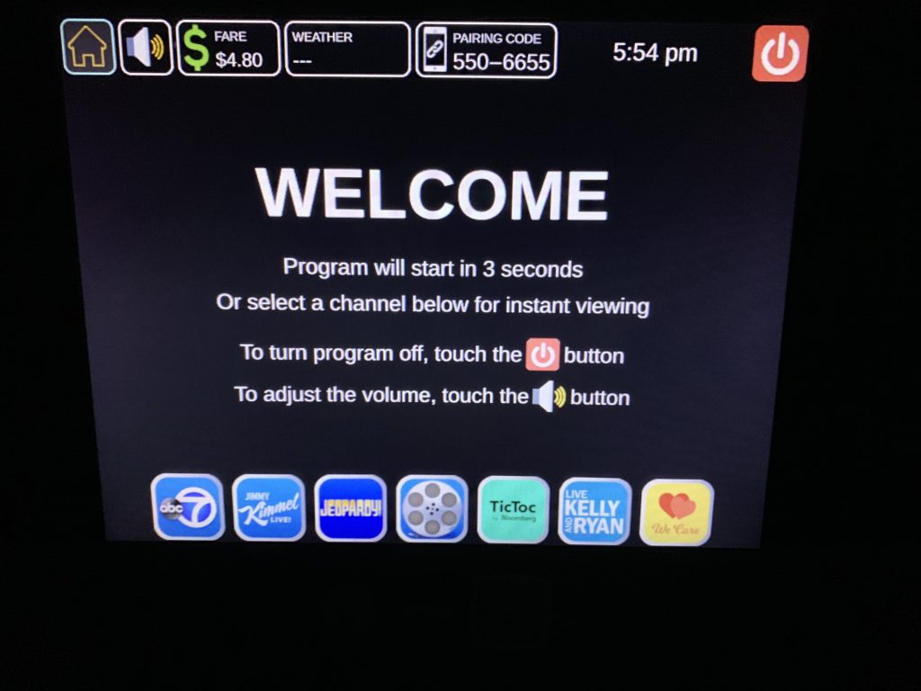
Yesterday I took a taxi with my friend, and I watched her interact with the advertising screen and payment machine. As soon as we get on the taxi, the screen automatically started to play some directions for accessibility. But my friend didn’t pay attention to it. While in the driving, she was bothered by the sound from the TV show and turned the voice down.
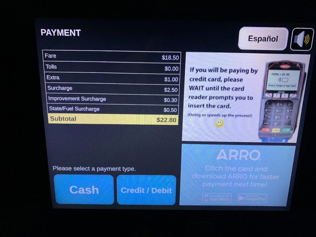
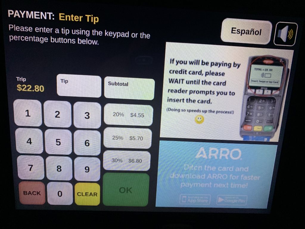
When we got to the destination and about to pay, the choice is showed on the screen “Cash” and “Credit/Debit”. There are two more buttons, one is to change to Spanish and the other is a picture of a speaker– I guess it can speak out the words and numbers on the screen as an accessibility feature, I don’t pretty sure because she didn’t tap on that. Then she chose “Credit/Debit”. This is not a hard choice since she only got 2 choices. Next screen is for the tips, after the selection of the number, she swiped the card. It is a machine that both support card with and without chip. But it is too dark in the taxi and it took her for a while to find the place to insert the card.
During the experience, I really like the accessibility design of it. When we first get into the car, it has a strong announcement that tell the passenger there is a accessibility system. So passengers in need won’t miss it. I would like to see more about it for the next time.