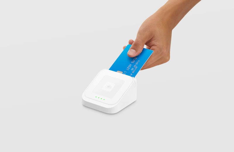
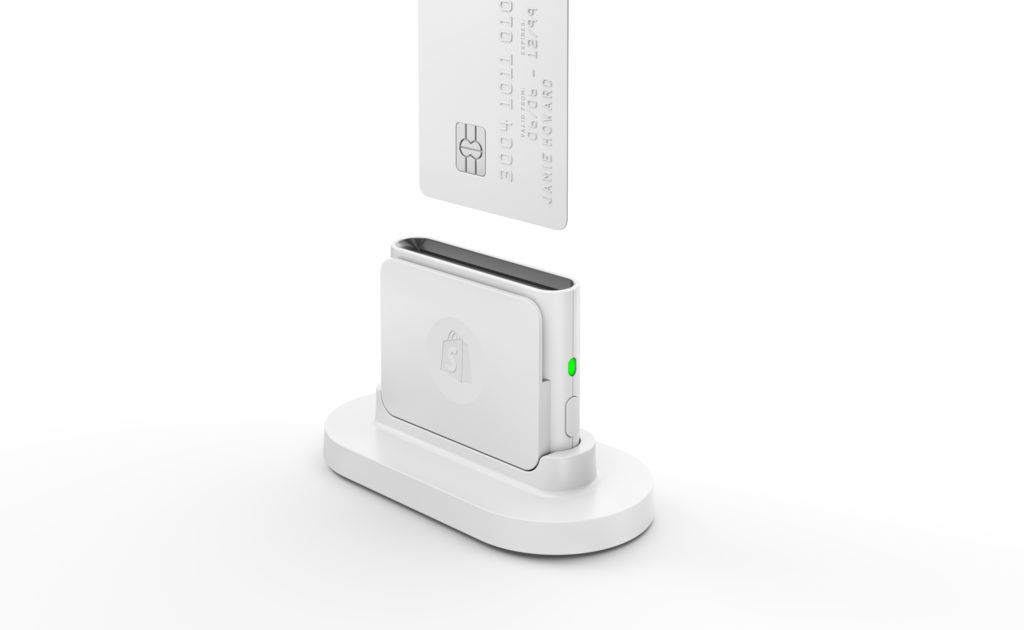
I work at a coffee shop in Boerum Hill called “Regular Visitors”. We have the above Shopify Card Reader to process all of our credit card transactions, and several times a shift I see people putting their card in backwards (chip needs to face towards them), upside down, or in the swipe slot instead of the chip reader slot. That is if they even see it against our white marble counter. The reader dips in a bit on the front which shows the Shopify logo, which is useless to the user. There is no signifier as to how they should insert their card. Furthermore, once inserted there is no feedback on the transaction. The green light on the side is only an indicator of the bluetooth connection status, but tells nothing to the user. Transactions with Shopify take longer than one done by their competitor, Square. Customers are used to it only taking a few seconds, so they often pull out their card before it’s ready to be taken out. The Square reader (depicted below) has four green lights that act as a progress bar, and acknowledge when you insert, while it’s processing, and once it is done. I would recommend that Shopify adopt a similar system of signifying to the reader what they are supposed to do with it. However both card readers are quite beautiful, which as Norman discussed in “Emotional Design”, has merit.