Love Machine

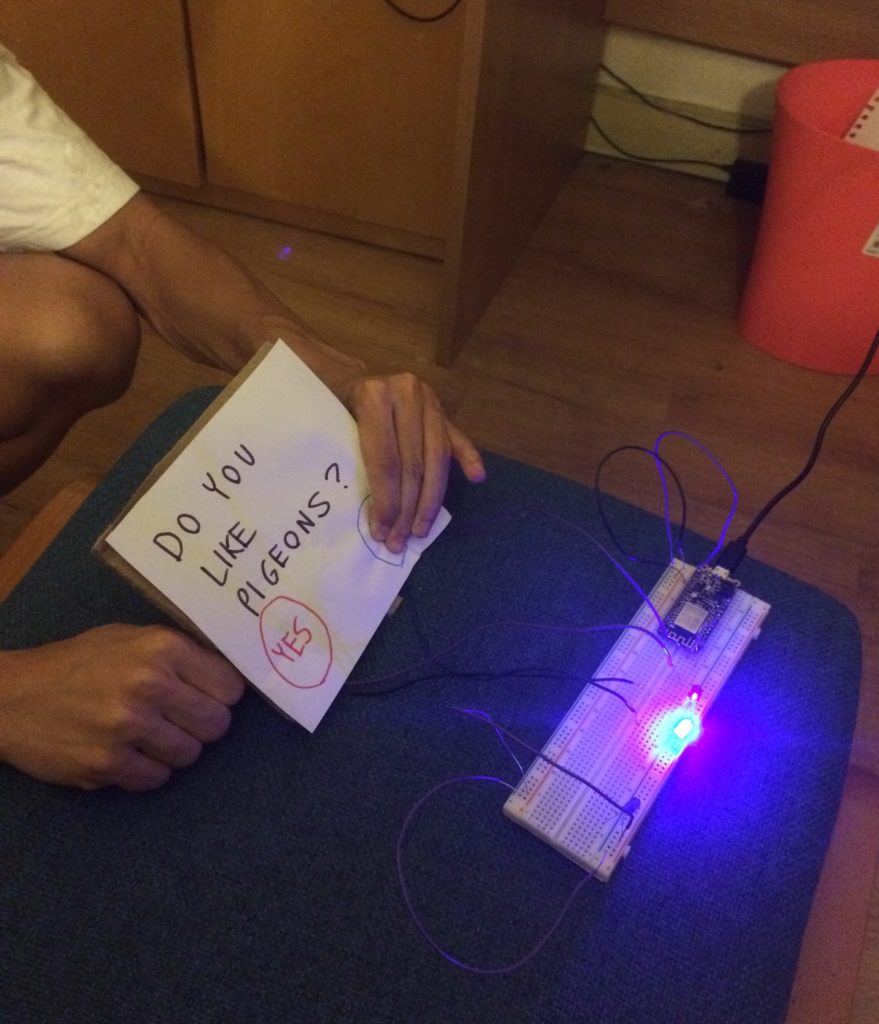
For my “love machine”, I had the idea to create a game based on switches. The two players would answer yes or no questions. Pressing “yes” would cause the red LED to go off. Pressing “no” would cause the blue LED to go off. The players would record the number of answers they had in common. The game could come with a booklet or app that tells the players how to rate their compatibility based on their answers. I think the affordances are the switches that allow the user to manipulate the circuit. The signifiers are the red and blue buttons on the interface. I think it would look even better with arcade-style buttons. I think that using LEDs actually uses the body in an interesting way. If you have two players blurting out answers at the same time, I think there is more room to backtrack. And writing out answers is much slower. Using LEDs is more fun, immediate, and accurate.

Love Machine

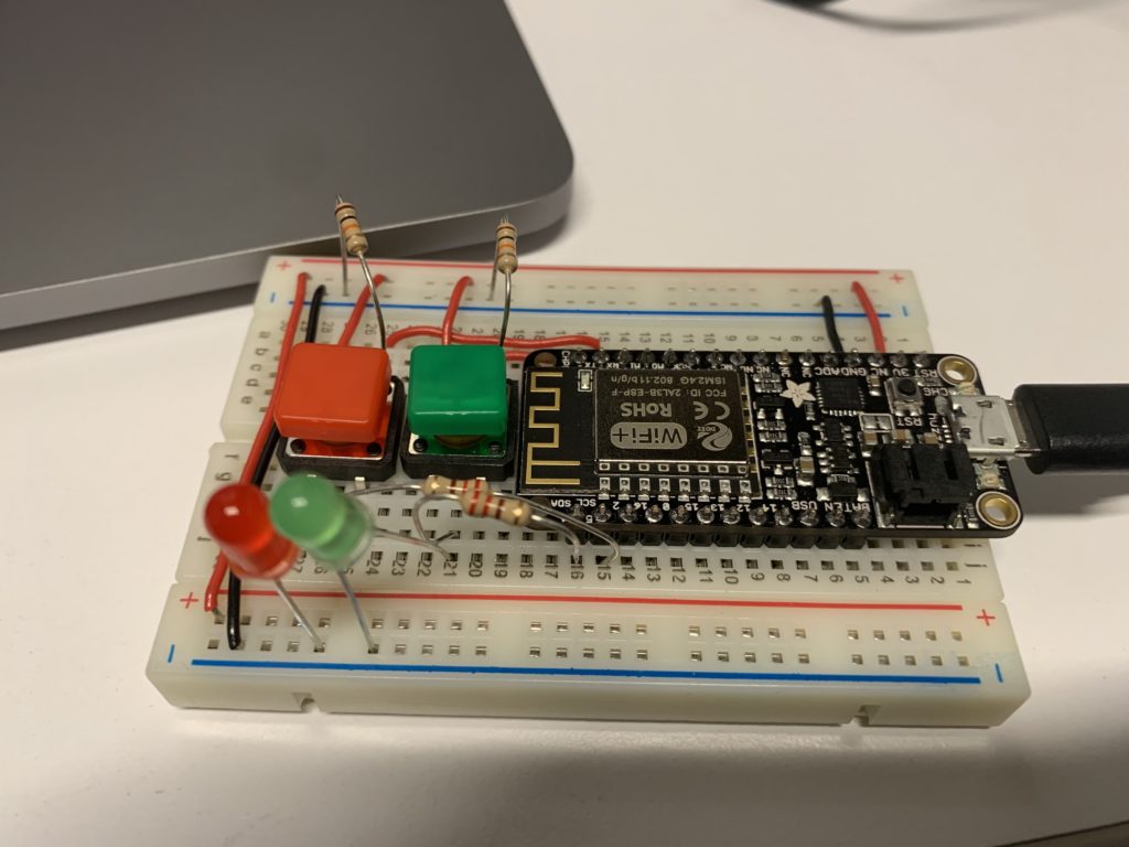
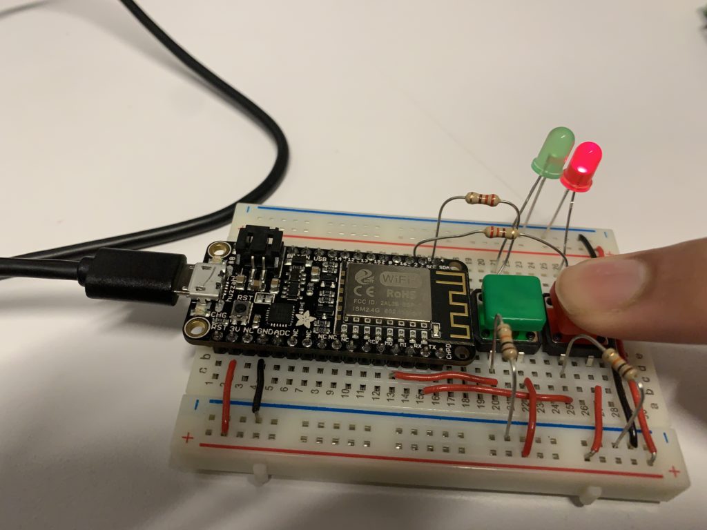
For my love machine, I wanted to emulate the swiping mechanic from dating apps into a button system. I wanted a way of matching people by accepting or rejecting them using green and red switches and LEDs. I programmed the microcontroller with two colored switches that are connected to their respective color of LED. If you press the green button, then the green LED would turn on. If you press the red button, the red LED will turn on. Instead of using simple switches, I opted to use the colored one so anyone using the circuit would know which button to use in order to activate the correct LED. This idea came from the Prepared Brain idea from “Attractive Things Work Better” where the brain naturally assoicates things such as color.

Fortune cookie

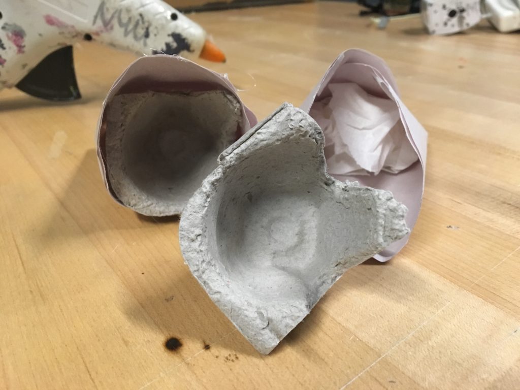
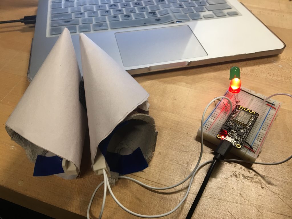
Eric, Julian, and I came up with a different kind of love-machine. We attached a magnetic contact switch onto two halves of a giant fortune cookie. The idea is that the person has to “crack” open the cookie (this turns the switch off) which then prints in the serial monitor the predicted time (in minutes) until he/she meets his/her soulmate.

We came up with the metaphor thinking that it would be a simple and straightforward yet delightful experience.

Before experimenting with the physical interface (the cookie), we set up the circuits following this tutorial that walks through how to monitor the opening of a typically closed door. It didn’t work the first couple of times as we found that:

  1. The Arduino UNO (used in the guide) produced 5V instead of the ESP8266’s 3.3V… meaning, we had to substitute the recommended 10kΩ resistor with a 220Ω one.
  2. We had to rely on our instincts to make sense of the guide (pin numbers and all) in terms of our microcontroller model.

We attempted using a while loop and a higher-level if statement to stop the loop from running once the cookie’s been cracked open so that it only gives one prediction per person. Both didn’t work so, for now, we increased the delay after the loop so that Arduino doesn’t keep spitting out random predictions.

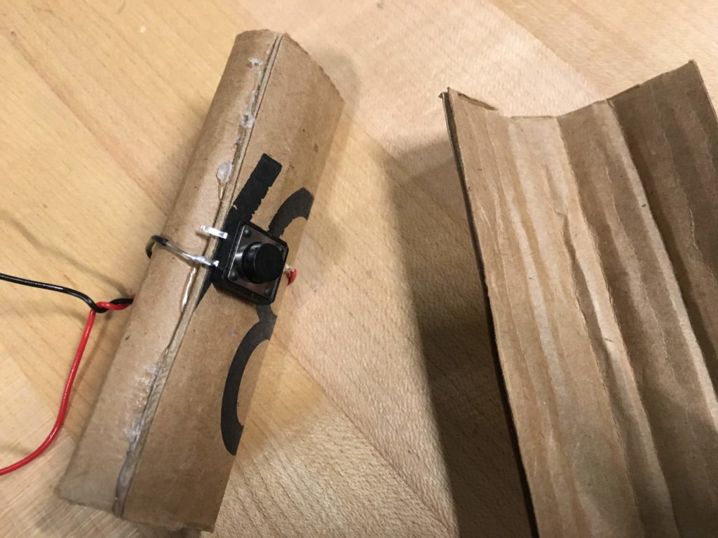
We designed the switch so that it at least looked like a fortune cookie. Its physical appearance would serve as the cue to its operation. The line printed in the serial monitor that reads: ‘Open the fortune cookie’ and the fortune cookie-looking fortune cookie were signifiers. The size of the cookie allowed for deep holes on each side on which the user could grasp onto. The cookie’s holes afforded gripping and pulling apart. We also stuffed the pocket with tissue and enclosed in some egg carton cells under each half to keep the user’s thumb from going too deep into the cookie which makes it harder to pull apart. By doing this, we designed constraints to limit mistakes that our users could commit.


To keep the two halves ‘stuck’ like a complete fortune cookie, we glued velcro patches where they should be connected in its pre-cracked state.

Love Tester Machine

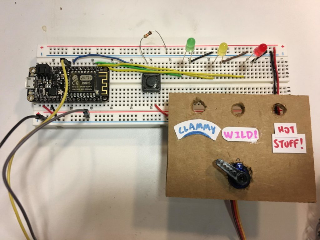
Initally, I created my love tester machine with a push button switch as the input, and 3 LEDs and a servo motor as the outputs. When the switch is pushed, the LEDs start blinking erratically while the servo sweeps back and forth, as the machine “decides” the compatibility of the couple. After a few seconds, it settles on an option by swinging its arm in that direction, while the corresponding LED lights up.

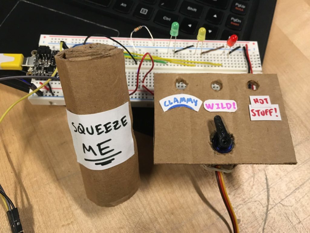
After thinking about the readings over the past couple weeks, I decided to iterate on my design. I thought about the Future of Interactive Design Rant, and noticed that the push button didn’t really utilize the full capabilities of our hands. So, I put the button inside a joystick-like thing so that when it’s squeezed, the button is still pushed in the same way, but gives a more interactive feeling to the user since their hands are used in a more natural way.

In this particular design, I think the joystick affords holding or squeezing with the hands, but since it wasn’t too clear, I put a signifier in the form of a sign that says “squeeze me.” This fulfills the role of a signifier by making the affordance of squeezing clearer. I also thought about the information taken in by the user and the information that is sent out by the machine. The tactile input alone has a bandwidth of a million bit/s; the LEDs that light up give out 10,000 bit/s and the sound of the servo turning gives out 100,000 bit/s. And although, consciously we can only perceive a small amount of this information, it’s interesting to see how it flows throughout the system.

initial design
final design
switch design

A Door Handle…Really?

My observation, (not stalking anyone really) was at my work study job at Stern. I work in the financial department out of anything else, and I was happily typing away trying to catch up on homework assignments, when a group of intellectuals came through the doors. I of course said good afternoon and proceeded to continue my typing. Now people who work at Stern and are professors at Stern are obviously brilliant people. People all around the world from oxford to Harvard come pass those glass doors by my little cubicle. However, these group of intellectuals, after they had finish their meeting in the conference room, were trying to lock the door of the conference room. I watched in awe and a little bit of laughter as I saw these group of smart and successful people all try to lock the door! In my mind I thought, “this can’t be too hard…like really guys”. Eventually after many attempts at trying to look the door with different types of keys, one person asked my supervisor on how to lock the door. She took out her keys, and in one swoop, the door was locked!

During this observation I realized that the group of intellectuals trying to open the door were all trying to lock the door at the same time. All trying to prove they could lock the door themselves. Also, the number of keys that was given to them, was ridiculous and that was obstacle that they had to encounter as well. Asking for help and maybe even in the future asking for the specific key of a room would be more beneficial than standing and fighting over who could lock the door first.

Furthermore, when I think of the affordance and the signifiers in my observation, I remember on how Don Norman of Design of Everyday Things defines affordances versus signifiers, “Affordances define what actions are possible. Signifiers specify how people discover those possibilities: signifiers are signs, perceptible signals of what can be done”. (Norman XV) I believe the affordance in this case was trying all the keys to unlock the door, an action that at the time was seen as the only possibility. The signifier would have to be the group of intellectuals looking at how each key was shaped and which ones could possibly be the key to lock the door.

Bradbury Readings

I would just like to say, reading There Will Come Soft Rains reminded me of the popular legend of Rome being burned to the ground while the Roman dictator Nero played the fiddle. A living space that used to beautiful, efficient, and useful; now a piece of useless knowledge and death. There is definitely a visible critique of interactive network devices; interacting with no one and nothing. Humans have somehow died out or disappeared from existence. When the devices are cleaning the house, cooking food, and setting the alarm on and off for humans, they seem to have a purpose. However, since humans are no longer there the devices no longer have a purpose. They seem desperate and hopeless. Issues of waking up on time, going to work, making breakfast, or telling bedtime stories without having to pull a book out no longer exist because there is no human to interact with these network devices. Another story by Ray Bradbury called, The Veldt, reminds me of the Turn of the Screw. The children are very much disturbed and, in the story, they are described as being neurotic. The parents start to notice the tendencies getting worst in their children due to a “nursery” filled with virtual reality. The most prominent virtual reality in the short story is the veldt in Africa. Eventually the parents and the children’s psychologist decide to shut down the nursery and every other interactive network device they have in the house. There is a definite comparison between the house in There Will Come Soft Rains and the house in The Veldt. Both houses are very much created for comfort, in The Veldt, the psychologist even states, “‘George, you’ll have to change your life.  Like too many others, you’ve built it around creature comforts.  Why, you’d starve tomorrow if something went wrong in your kitchen? You wouldn’t know bow to tap an egg.’” The two houses are both centered around this idea of “creature comfort” and that these mechanical devices have to interact with human beings in order for the house to thrive/live. Another comparison I see between the two stories is that both house do “die” out in the end of the stories. There is a use of personification of the houses, that somehow the house has life, they live and they breath just like humans do. The house even tries to save themselves in different ways. The house in There Will Come Soft Rains, tries to save itself using the interactive network devices but ultimately the house dies in a fire. The house in The Veldt, technically dies at the end of the story with the parents shutting down all of the “essentials” in the house, but interesting enough, the children are the ones who try to save the house, and eventually this ending turns into mutiny, “‘I don’t imagine the room will like being turned off’, said the father. ‘Nothing ever likes to die —even a room’” (The Veldt).

            In essence, the critique of both short stories shows concerns and issues about problems with the actual interaction between network devices and humans. How these two very powerful elements coincide together and how efficient each one is. The most important issue is how humans rely on these machines, and how machines rely on humans. With the work we are doing in class, I believe that critical thinking and deep discussions about one’s product can be something that is humans see as necessity but not a crutch could create a better environment for our future generations.

“‘Lydia, its off, and it stays off. And the whole damn house dies as of here and now. The more I see of the mess we’ve put ourselves in, the more it sickens me. We’ve been contemplating our mechanical, electronic navels for too long. My God, how we need a breath of honest air!’”
Badly designed machine

After trying—and failing—to find other people conspicuously struggling with a poorly designed object, I’ve found something that warrants this analysis: the machine in the lobby of my dorm that puts money on laundry cards. I’m not gonna pretend like I saw someone fighting with it and realized—just in time for this writing assignment—that it fit the bill. No, I’m writing about this piece of machinery because I know, from personal experience, that it’s really badly designed. 

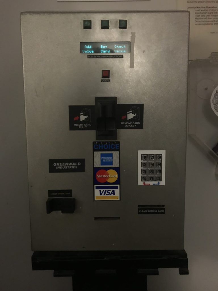
In order to use the laundry machines in the basement, you need to pay with something called a Hercules Card, which you’re given at the start of the school year. These cards are refilled at the machine in the lobby, and the machine looks like this: 

The machine’s components have different affordances, and these seem functional enough. The two card slots that protrude from the machine afford card access and the two recessed card slots seem to be involved in some similarly card-related process. The number pad affords personal verification, presumably for something like a PIN number, and the four buttons toward the top of the machine afford interaction with the operating system. All of this seems fine on its own.

Enter the signifiers, and things break down. It’s unclear what each of the card slots is actually for, because the labels that usually signify which card goes where are either ambiguous or not there. Does the Amex/Mastercard/Visa label mean that the card slot directly above it is for payment method? Or do credit cards go into the card slot on the left, because aren’t credit cards sometimes called “smart cards”? No signifier indicates where the Hercules Card should go. And what on earth is that totally unlabelled card slot at the bottom-center of the machine? Is a third card going to come out of the machine that’ll later be “removed” on the right?

If I were to redesign this machine, I’d fix up the signifiers and label things clearly. That seems like an anticlimactic way to end this piece, but I don’t really see there being much more to it.

Observation

Shopify Credit Card Processor

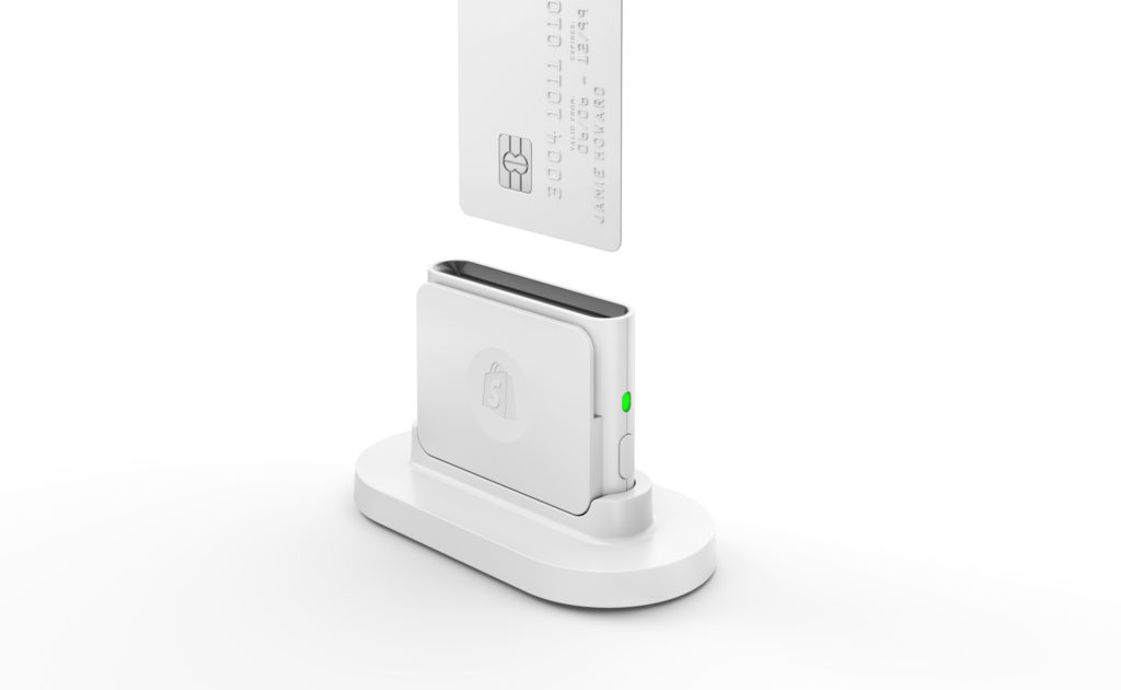
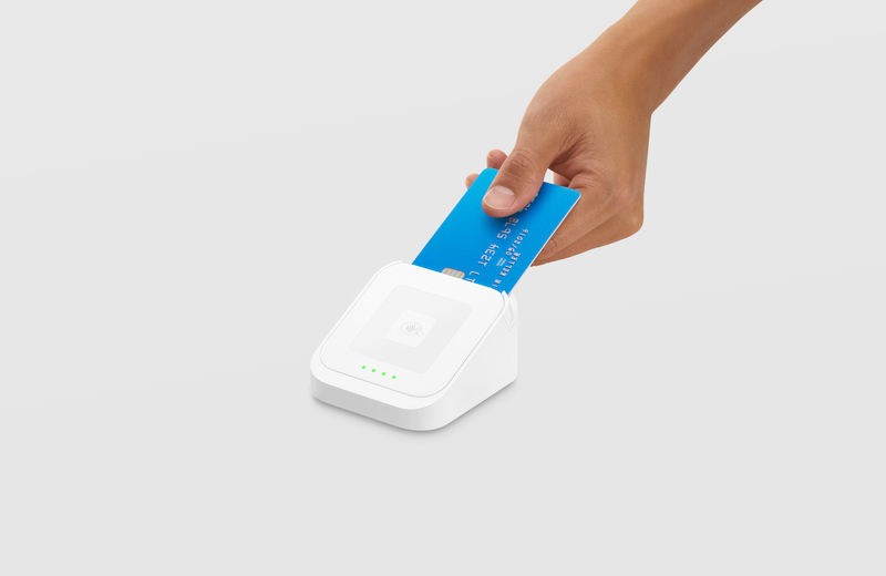
I work at a coffee shop in Boerum Hill called “Regular Visitors”. We have the above Shopify Card Reader to process all of our credit card transactions, and several times a shift I see people putting their card in backwards (chip needs to face towards them), upside down, or in the swipe slot instead of the chip reader slot. That is if they even see it against our white marble counter. The reader dips in a bit on the front which shows the Shopify logo, which is useless to the user. There is no signifier as to how they should insert their card. Furthermore, once inserted there is no feedback on the transaction. The green light on the side is only an indicator of the bluetooth connection status, but tells nothing to the user. Transactions with Shopify take longer than one done by their competitor, Square. Customers are used to it only taking a few seconds, so they often pull out their card before it’s ready to be taken out. The Square reader (depicted below) has four green lights that act as a progress bar, and acknowledge when you insert, while it’s processing, and once it is done. I would recommend that Shopify adopt a similar system of signifying to the reader what they are supposed to do with it. However both card readers are quite beautiful, which as Norman discussed in “Emotional Design”, has merit.

A11 on grey background.