Network Infrastructure

For the first piece of network infrastructure, I noticed a large white box on the roof of my apartment building early in the week. After checking Ingrid Burrington’s guide, I learned it could have been a microwave antenna, due to its cylindrical shape, which would be providing internet service to the building. The antenna likely connects to another antenna and provides for the tenants of the building below.

The next device is an NYPD security camera, which was located on an intersection in downtown Manhattan. The device had two cameras and a medium sized antenna attached at the top. The device most likely transmits a live feed of whatever the cameras are recording using the antenna. As for the internals, the device probably has components for transmission as well as storage for backup recordings. It exists this way in order to record and watch the streets.

The third and final device is a red light camera I observed in Queens after a few cars ran the light and its camera started to flash. This device detects when a car has crossed the intersection during a red light and then takes a picture of the car in order to identify its license plate. It exists in this form because it needs to be higher up in order to have a vantage point of the intersection, the car, and its license plate. The box is most likely wired through the pole to an external device.

City Infrastructure


This first drawing is of a conEdison manhole cover. I’ve been seeing lots of these around the city and wonder what exactly they lead to. Last night while walking home I also saw a conEdison truck with crew going down into one of these manholes. A little research shows that conEdison is an electricity company, but I still wonder what exactly one could find down there.

My next observation is of this little white box above a street light. There were little holes on the front too which I thought was an interesting design choice. My only guess is that this controls the traffic lights themselves but I can’t be certain.

This last drawing is of a building I can see from my window. It is the AT&T building on Ave of the Americas I believe. I know it’s related to AT&T because there is a doorway directly from the Canal subway station into this building and a sign says
“AT&T Building” (or something like that). I can see the roof of the building from my dorm and I just know there is some major internet related things going on up there. Maybe it is a cell tower though? I am unsure but would love to find out.

A Door Handle…Really?

My observation, (not stalking anyone really) was at my work study job at Stern. I work in the financial department out of anything else, and I was happily typing away trying to catch up on homework assignments, when a group of intellectuals came through the doors. I of course said good afternoon and proceeded to continue my typing. Now people who work at Stern and are professors at Stern are obviously brilliant people. People all around the world from oxford to Harvard come pass those glass doors by my little cubicle. However, these group of intellectuals, after they had finish their meeting in the conference room, were trying to lock the door of the conference room. I watched in awe and a little bit of laughter as I saw these group of smart and successful people all try to lock the door! In my mind I thought, “this can’t be too hard…like really guys”. Eventually after many attempts at trying to look the door with different types of keys, one person asked my supervisor on how to lock the door. She took out her keys, and in one swoop, the door was locked!

During this observation I realized that the group of intellectuals trying to open the door were all trying to lock the door at the same time. All trying to prove they could lock the door themselves. Also, the number of keys that was given to them, was ridiculous and that was obstacle that they had to encounter as well. Asking for help and maybe even in the future asking for the specific key of a room would be more beneficial than standing and fighting over who could lock the door first.

Furthermore, when I think of the affordance and the signifiers in my observation, I remember on how Don Norman of Design of Everyday Things defines affordances versus signifiers, “Affordances define what actions are possible. Signifiers specify how people discover those possibilities: signifiers are signs, perceptible signals of what can be done”. (Norman XV) I believe the affordance in this case was trying all the keys to unlock the door, an action that at the time was seen as the only possibility. The signifier would have to be the group of intellectuals looking at how each key was shaped and which ones could possibly be the key to lock the door.

Badly designed machine

After trying—and failing—to find other people conspicuously struggling with a poorly designed object, I’ve found something that warrants this analysis: the machine in the lobby of my dorm that puts money on laundry cards. I’m not gonna pretend like I saw someone fighting with it and realized—just in time for this writing assignment—that it fit the bill. No, I’m writing about this piece of machinery because I know, from personal experience, that it’s really badly designed. 

In order to use the laundry machines in the basement, you need to pay with something called a Hercules Card, which you’re given at the start of the school year. These cards are refilled at the machine in the lobby, and the machine looks like this: 

The machine’s components have different affordances, and these seem functional enough. The two card slots that protrude from the machine afford card access and the two recessed card slots seem to be involved in some similarly card-related process. The number pad affords personal verification, presumably for something like a PIN number, and the four buttons toward the top of the machine afford interaction with the operating system. All of this seems fine on its own.

Enter the signifiers, and things break down. It’s unclear what each of the card slots is actually for, because the labels that usually signify which card goes where are either ambiguous or not there. Does the Amex/Mastercard/Visa label mean that the card slot directly above it is for payment method? Or do credit cards go into the card slot on the left, because aren’t credit cards sometimes called “smart cards”? No signifier indicates where the Hercules Card should go. And what on earth is that totally unlabelled card slot at the bottom-center of the machine? Is a third card going to come out of the machine that’ll later be “removed” on the right?

If I were to redesign this machine, I’d fix up the signifiers and label things clearly. That seems like an anticlimactic way to end this piece, but I don’t really see there being much more to it.

Observation

Shopify Credit Card Processor

I work at a coffee shop in Boerum Hill called “Regular Visitors”. We have the above Shopify Card Reader to process all of our credit card transactions, and several times a shift I see people putting their card in backwards (chip needs to face towards them), upside down, or in the swipe slot instead of the chip reader slot. That is if they even see it against our white marble counter. The reader dips in a bit on the front which shows the Shopify logo, which is useless to the user. There is no signifier as to how they should insert their card. Furthermore, once inserted there is no feedback on the transaction. The green light on the side is only an indicator of the bluetooth connection status, but tells nothing to the user. Transactions with Shopify take longer than one done by their competitor, Square. Customers are used to it only taking a few seconds, so they often pull out their card before it’s ready to be taken out. The Square reader (depicted below) has four green lights that act as a progress bar, and acknowledge when you insert, while it’s processing, and once it is done. I would recommend that Shopify adopt a similar system of signifying to the reader what they are supposed to do with it. However both card readers are quite beautiful, which as Norman discussed in “Emotional Design”, has merit.

A11 on grey background.

Observation Homework

I was waiting in line at McDonald’s for a coke. The McDonald’s in Union Square has kiosks to order off of, because they don’t always have cashiers to make the transactions. The person in front of me (and I when it was my turn) had trouble ordering off of the kiosk.

The most frustrating thing about the kiosk is, there’s absolutely no affordances when you tap something. Normally when you have an interface or an object you know it’s being tapped because it highlights the portion that has been tapped or has a loading indicator. The person was trying to order some McNuggets but when they tapped on the menu item nothing had occurred. This quickly led to the person trying all sorts of different ways of jabbing their finger into the screen as hard as they could. The lack of knowing what the kiosk is doing here is the real problem because we expect when we touch something, it reacts to us. After the kiosk had finally picked up the person’s tap, it didn’t choose the right menu item. That process was started again when they were trying to hit the cancel button and go back.

When you usually go through interacting with a touchscreen or an object, we need to know that the object has taken, accepted our input and is doing something with it. It had no signifiers and when it actually did they were delayed. When they went to pay at the kiosk, there was nothing telling the person to use the terminal to pay with their card. Just “pay here” was posted with all of the payment options. I thought it was particularly interesting because this is supposed to take less time than a cashier and yet I couldn’t help but think I might’ve already ordered by the time this actually finished. My ideas to improve the kiosk would make it more responsive and if it’s not recognizing a tap on a button at least put a dot to indicate where the person tapped, so they can tap more precisely if that’s the issue. People need to know what the kiosk is doing when they’re trying to order their food.

Observation

Yesterday I took a taxi with my friend, and I watched her interact with the advertising screen and payment machine. As soon as we get on the taxi, the screen automatically started to play some directions for accessibility. But my friend didn’t pay attention to it. While in the driving, she was bothered by the sound from the TV show and turned the voice down.

When we got to the destination and about to pay, the choice is showed on the screen “Cash” and “Credit/Debit”. There are two more buttons, one is to change to Spanish and the other is a picture of a speaker– I guess it can speak out the words and numbers on the screen as an accessibility feature, I don’t pretty sure because she didn’t tap on that. Then she chose “Credit/Debit”. This is not a hard choice since she only got 2 choices. Next screen is for the tips, after the selection of the number, she swiped the card. It is a machine that both support card with and without chip. But it is too dark in the taxi and it took her for a while to find the place to insert the card.

During the experience, I really like the accessibility design of it. When we first get into the car, it has a strong announcement that tell the passenger there is a accessibility system. So passengers in need won’t miss it. I would like to see more about it for the next time.

Observation Homework

The one interface that I tend to a lot is the vending machine. I see many people frequent the vending machine in between classes and I was observing them during my gaps. Don Norman talks about how affordances are defined by what actions are possible, he mentions that affordances became much more confusing with the addition of virtual objects. Due to the fact that the interfaces of vending machines have really changed in the past couple of years, from being simple interface of using simple inputs to having a complete digital interface. The affordances are the various combinations that could be pressed in order to obtain the specific item in the vending machines. The combination of the letters A-F and the numbers from 1-10. The various signifiers of the vending machines are the various buttons that are shown on the “screen” to show which buttons are which.

I realized that with the new interfaces of the vending machines it allows for a much more streamlined and seamless process to ordering something from the vending machine. I noticed that with the addition of use of credit cards, the process had become even more seamless. But I also realized that due to the touch screen that it had become an inconvenience due to the fact that the interface is not very efficient.

Vending Machine

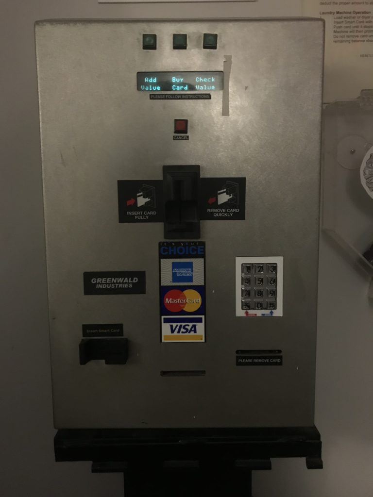
Yesterday, I observed my roommate Michael use a vending machine on the first floor of our dorm. Michael was trying to get a chocolate chip cookie from the bottom row of the vending machine. The vending machine has a touch screen display that gives step by step instructions. The machine tells you to swipe your card or insert money to begin. So Michael swiped his card, since he didn’t have any cash on him. The vending machine takes a couple of seconds to load after you swipe. The vending machine automatically takes $2.50 out of your card. Then it tells you to press the code of the snack you want. The vending machine has a small keyboard below the display. So Michael entered the code for the chocolate chip cookie. The cookie is supposed to then dispense. When you are finished with the transaction, the vending machine tells you to select another item, or press “complete” on the card reader (you don’t need to do this if you pay by cash). If the thing you bought was less than $2.50, pressing complete means that the vending machine changes the charge. If you don’t press complete, the vending machine asks you to buy another item, to use the rest of the $2.50. Once you press complete, the machine also tells you “Thank you, and have a great day.” Then after about 15 seconds, the display returns to its home screen. If you don’t press complete, after about 40 seconds the machine moves to the “Thank you, have a great day” screen, and then back to the home screen.

Unfortunately, the cookie didn’t dispense. There is a spiral shaped piece of metal that holds the food in place. The plastic casing of the cookie got stuck on this piece, and the cookie didn’t dispense. While this is disappointing, it is probably unavoidable. Since it would be impossible to design a frictionless vending machine, there is always a possibility that the food will not make it out the vending machine. However, It would be nice if the vending machine could have a sensor or device to determine if the food was dispensed and made it to the receptacle, and refund you if the food doesn’t dispense. Also, while this is more of a cosmetic improvement, it might be nice if the machine had a loading screen, since it takes a while to load after you swipe your card. Even though the machine clearly tells you to press complete on the card reader, a lot of people don’t do this. This means someone else could use the remainder of the $2.50 you paid. Perhaps the vending machine could have a big sign on it telling you to make sure to press complete. Or it could automatically take the whole $2.50 if you don’t press complete or select another item within 40 seconds. This would use negative reinforcement to get people to press complete.

When their food is stuck in the vending machine, many people will try to shake the vending machine to get it out. As far as I know, I don’t think this actually works. I suppose this would be an affordance of the vending machine: it is too heavy for an average person to pick up or move much. The touch screen display affords the user the ability to manipulate the machine through touch. The keyboard that you use to enter the code for the item you want affords you the ability to press letters and numbers. There is also a money scanner for dollar bills, and a coin slot. The money scanner affords you the ability to insert dollars, and the coin slots affords you the ability to insert coins. The messages from the machine are signifiers, with the exception of the last message that tells you to have a nice day.

Observation – MAGNET doors

I’ve made some observations about an interface that everyone in this class has used: the MAGNET doors. There are some problems with the way they unlock both for people entering and leaving. If you’re entering, you have to tap your ID on the card reader to unlock the doors. However, the glass doors, which allow you to see inside, also make it so the card reader has to be farther away from the doors. Additionally, even if your card won’t open the door, the light on the reader still goes green, and in most people’s minds, green = go. The distance also means that if your card didn’t work, you have to walk a couple steps back to re-tap or, as many people do, just ask whoever’s at the desk to let you in so you can get to class.

Then, once class is over and you’re on your way out, there’s a proximity sensor and a button to unlock the doors. The sensor is supposed to automatically unlock the doors when someone approaches, but it’s aimed poorly and only detects you if you’re either very tall, waving at it, or walking straight at it from a distance. Given that most Magnet classrooms are around the corner from the door, most people don’t walk straight at the door, instead staying close to the wall, and in the sensor’s blind spot. Therefore, most people go for the button, which suffers from the same problem as the card reader on the other side: it has to be on the wall, so it can’t be within arm’s length from the door. A few people I’ve talked to didn’t even know the sensor was there and always went for the button. I only figured out about the sensor because my apartment building growing up had an automatic side-entrance door with a similar problem: it wouldn’t detect me unless I waved at the sensor to open the door. That one didn’t even have a button, and the door was HEAVY so good luck getting it open without the machine’s cooperation. If these doors are this much of a pain to get through for me I can only imagine how difficult it would be for someone in a wheelchair or someone with limited use of their arms or hands.