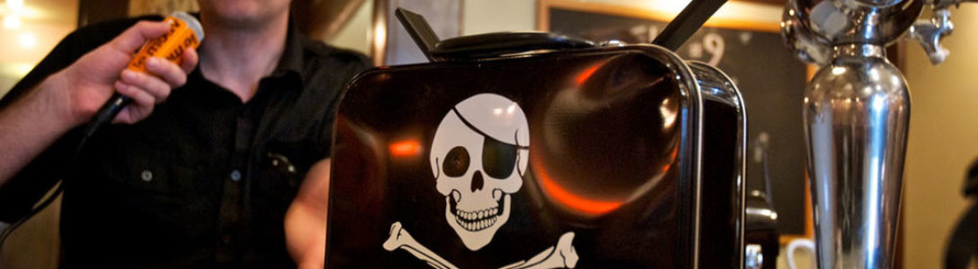
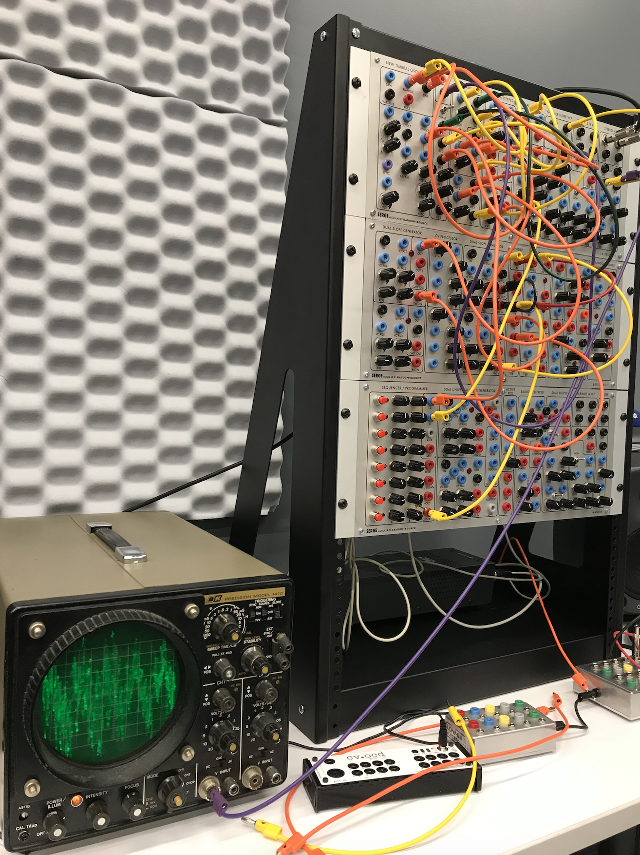
Last Friday, I was observing a student trying to compose sound effect by using serge synthesizer and oscilloscope in IDM audio lab. Serge synthesizer is an analogue module synthesizer and oscilloscope is a laboratory instrument used to display and analyze the waveform of electronic signal. In order to create sound effect, the student has to connect the audio signal and control voltage jack via banana cables. At the beginning, he started with plugging in banana cables to the speaker output. After making some basic sound effect, he started to add more cables and adjust other cables in order to create more variables and achieving the ideal sound. The intriguing part is that there are six different colors for the cables, and each color has a specific length. During the observing process, despite the time he used for listening the sound and wondering about how to adjust it, most of the time he is switching the cable to the one with the suitable length and finding where to plug in. Nonetheless, I noticed that sockets on the synthesizer has four different color, each color for a different function. The red one is for control, purple for sync, etc. This efficiently shorten the student’s time for finding which is the appropriate socket to plug in. After all, this machine seems complicated to me, but actually it possesses a special module arrangement and color differentiation to simplify it’s interface.
Category: observation
Observations
The Bobst Library Computer Center, at which I am employed, provides a variety of services, among which are large book scanners on every other floor of the library. Those scanners hold the first place in the ranking of things patrons complain the most about. These large machines are operated by a neighboring touchscreen, and those touchscreens are a menace. They are 20″, the screen itself is nearly unresponsive. Patrons have to put a lot of effort to push at the buttons, which is not accessible to people with limited mobility. And when we, the BLCC staff, go to the floor to look at the scanner, we have a hard time – the machines are heavy, the screens even heavier, and we have to punch in an excessive number of admin passwords and codes, which again is impeded by the size and the lack of sensitivity of the screen.
Finally, most patrons don’t even need to scan books anymore, as the number of people who use physical books in their research is getting smaller. The most that needs scanning these days are a couple loose pages of a signed document, which the smaller scanners on the first floor labs are perfectly suited for. It would make much sense to switch out at least half of the book scanners with smaller single pages scanners, and yet it seems unlikely to happen in the nearest future.
Turnstile
I was going into my dorm and there are these card scanners that let you go through the turnstiles to enter the dorm. But honestly these don’t work as well as people would think. I saw someone behind me while waiting for the elevator. She scanned her card, put in her pin. As she tried to go through those wretched turnstiles she just rammed her side into it and it didn’t budge. How much would that have hurt…. A LOT. I’ve felt it before. She tried again… but again it didn’t work, this time she was more cautious. Third time, it didn’t work again. It worked the fourth time. Why was I there for so long? Because the elevators are so slow. SO SLOW. It goes up and down and the doors open so slow. Everything doesn’t work as well as it should.
The girl saw that she should have been more careful the second time, since she rammed her side into the turnstile. This was the affordance. The signifier was the fact that she most likely bruised herself trying to go through the first time.
Observation Assignment
In class the other day, I was observing my professor interact with the touchscreen interface for the projector. They were trying to change the output of the projector to their laptop but were having a difficult time changing the input. The touchscreen panel was small, about 8 inches by 5 inches with icons for each of the outputs. They would constantly press the buttons on the touchscreen and after a minute, the touchscreen interface performed every delayed action almost simultaneously and finally displayed her laptop. I think the touchscreen allows for more errors when compared to physical buttons due to the need for feedback from the touchscreen. Another observation I made was of a girl trying to use her laptop when it suddenly froze. For the first minute, she tried clicking using her trackpad, swiping and performing touch gestures, and conducting keyboard commands. Following this, she back away from the laptop and eventually, she was able to continue on whatever she was doing. The main barrier she encountered was not being able to access anything on her laptop through any of the controls given to her.
Elevator
Last night, I observed my friend operate the elevator of an apartment building in Chelsea. She and I had the goal of getting to the ground floor of the building, coming from the 5th floor.
First she pressed on the button to ‘call’ the elevator car. Once we walked in the elevator, I noticed how she was already positioning herself to get out of the car (think about how people organize themselves in front of subway doors as the train approaches a station). To get to the 5th floor earlier that night, the guests had already had the surprise of using the building’s front-side elevator (90 degree exit) which I would say is a format that isn’t commonly found in buildings in the city.
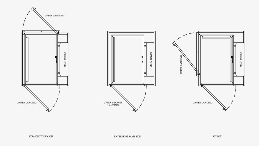
The first thing we noticed was that the interior had a wood-finish– doors, walls, ceiling, and floor. This design decision made the elevator feel warm and homey; however, it also made the elevator feel smaller than it actually was and darker because the wood didn’t absorb the ceiling lights very well. This caused her to survey all four sides of the car to see where the doors would open to the ground floor. While the affordance of controlled transport (of moving up and down) is provided by the control panel holding all the buttons, the affordance of entry and exit is provided by the opening and closing of doors. As for the two-sided, two-panel center parting elevator doors, the signifier would be the car’s sill line.
Because elevator doors need not be manually opened or closed, there were no door handles extending from the surface. The dark interior and perceived tightness of the room confused my friend who was deciding which direction to face to prepare for a smooth exit onto the ground floor. It was only when the doors had actually opened (which did not take a long time from the 5th floor) that she was able to find the right side for exit. This frustrating experience could have been avoided if the designers had taken into consideration the users’ mental model of the typical (one-sided) elevator and anticipated the users’ unfamiliarity with this kind. They could have made the necessary adjustments to the interior design of the car (which would’ve made the sill line more obvious and visible) and maybe even install an additional guide (blinking lights) to signal which set of doors to exit through.
Subway Ticket Machine
On Wednesday, I went into the train station and saw one person behind each one of the three subway ticket machines, which are called ticket vending machines (TVM). I lined up behind the right one, where a man was using the machine to probably buy or refill a metrocard. I watched as he interacted with the screen attached to the TVM, as he selected “start,” then selected “English” as the language, and then chosen to “refill” his metrocard by “adding value.” But when he reached the pay stage, he ran into some trouble. This particular machine only accepted coins as a payment method. In fact, out of all three of the available machines, two of them only accepted coins and one accepted only cash. At this point, he left, but later came back to use the cash only TVM to refill his metrocard. These observations can be viewed within the context of this weeks readings – the Design of Everyday Things talks significantly about how good design is almost invisible, and should leave the user with a positive experience (or at least not a bad one). In this interaction, the machine’s buttons afford pushing, the small slot affords inserting coins, and the larger slots afford inserting and removing cards and bills. The huge slot at the bottom affords putting your hand in and taking things. The screen affords the ability to navigate through by touch. The signs that say “$1, $5” all the way up to “$50” are signifiers, and tells us that we are able to insert 1 dollar bills and 5 dollar bills but probably not $100 bills. The metrocard slot is indented inwards, which signifies to us that we should insert something in, rather than take something out. The buttons on the screen tell us specifically if we want to add time or value or use our credit or debit to pay. There are so many instances of affordances and signifiers on a subway ticket machine, and these are just a few. The reading also mentions feedback, more of which could improve the machine. Having feedback on the screen to tell us whether the bill we inserted was crumpled and why it was spit back out to us could be helpful.
Observations | JH5363
Walking home I began observing peoples behavior. As I entered the subway I watched a woman swipe for admission and get rejected for insufficient funds. I tried to remember the last time I had refilled my card. Swipe. Beep. Insufficient funds…
At the refill station I reacquaint with the woman from earlier. This time her card refuses to be read from the machine. She pushes in and pulls out rapidly in a seemingly endless battle until luck performs his reappearing act and her pin is prompted. She leaves with a bare level satisfaction and I weep with joy as my bills are accepted.
Just before I triumphantly swipe through the gates, a kid plants his hands onto the sides of the gate next me, swings his legs up, and bounces through to the other side no questions asked. My celebration came to a quick end.
I’ve observed two main flaws within the MTA subway systems. First is the lack of convenience provided by them. While of course their transportation abilities are worthy even with some delays and unexpected shutdowns, the real problem comes from filling up the cards and the unfortunately high fare cost. The second flaw is how easy it is for people to get into the subway system for free. If there isn’t a entrance that can be hopped, there is most certainly an exit door that riders would rather push open than struggle trying to exit out the same gates as people entering. This combination of flaws leads to a heavy culture of illegal subway which further causes costs for the city. This can be seen from the need for police patrolling the underground waiting to catch unsuspecting fare jumpers. Creating entrances that didn’t have people both enter and exit through the same interface combined with guaranteed swiping for entry and no entrance through the exit channel would lead to a secure system allowing only authorized entry. While this wouldn’t help with the process of filling up the metro card (which isn’t really that bad) it would remove the possibility of using the metro for free from anyones head. This possibility of escaping the fare upon entering the metro is an affordance the system allows users. By removing that affordance and maybe improving upon the mechanisms tied to filling the metro card (maybe online app for filling it) and much smoother process could be implemented. And maybe if enough people still pay for the metro the prices can be dropped overall. Its food for thought but bottom line is the authorization mechanisms and badly designed refilling interfaces complement each other in a way that leads to a worse result than our subway systems should allow.