Observation: Network Infrastructures

After reading Ingrid Burrington’s field guide to networks in NYC, I couldn’t unsee the devices and ‘marks’ of network as I moved around the city. Here are the memorable ones that I thought stood out from my routine path–– for different reasons.

12:03pm on 88th St bet 3rd Ave and Lexington

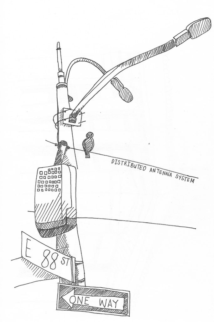
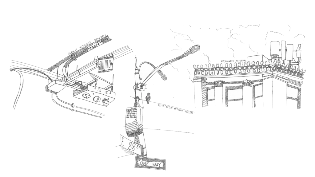
As i was walking to the 86th Street station, I noticed that one of the street lamps had added height to it. I recognized it, having read about it in the guide but did not remember what it was called so I took a picture of it to research on later.

Distributed Antenna System (DAS) • Helps distribute signal in under-covered areas; connected to fiber optic networks underground.

12:07pm, on the ceiling of the 86th Street Station: by the 6

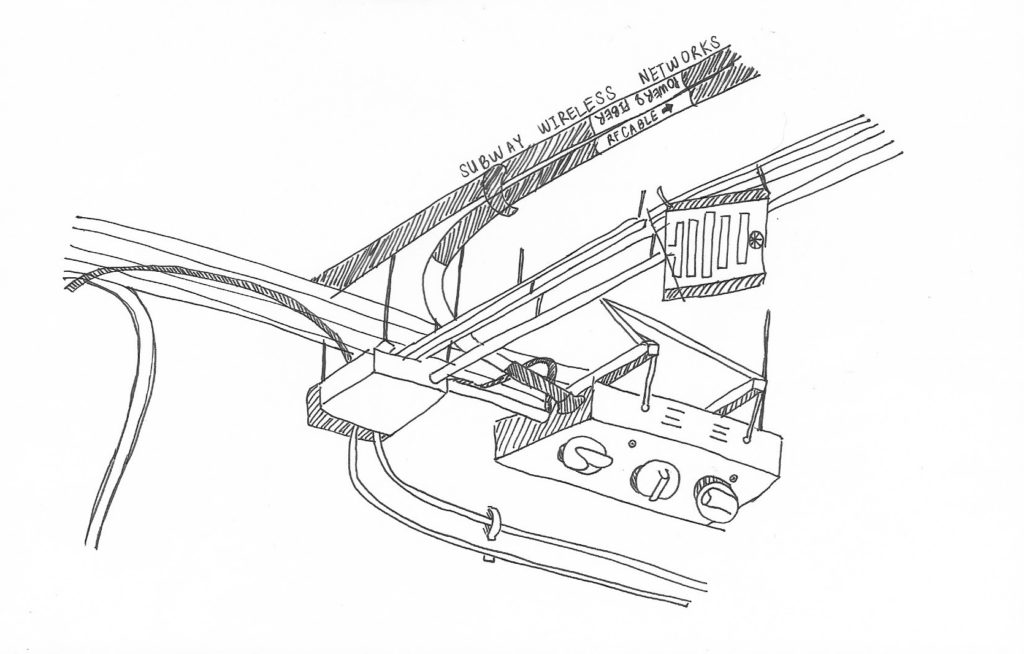
Last month, I noticed right above the spot where I wait for the 6 train, that there were knobs marked with “DO NOT PAINT” in bold. I wondered then, why it was so important not to paint over these knobs– having no clue what they controlled or if they even moved at all.

Seeing this in the guide gave me an aha! moment:

Subway wireless networks • Provides wifi connectivity underground

The big tubes are labelled “RF CABLE” and “POWER AND FIBER”, suggesting where and how the device is connected. RF stands for radio frequency– I inferred this based on the guide. Apparently the signals from the base station (home base) are distributed to the connected stations via these fiber optic cables and converted into RF signals.

**Subway wireless networks- also a DAS!

6:20pm, view from the Arnold Library @ Parsons

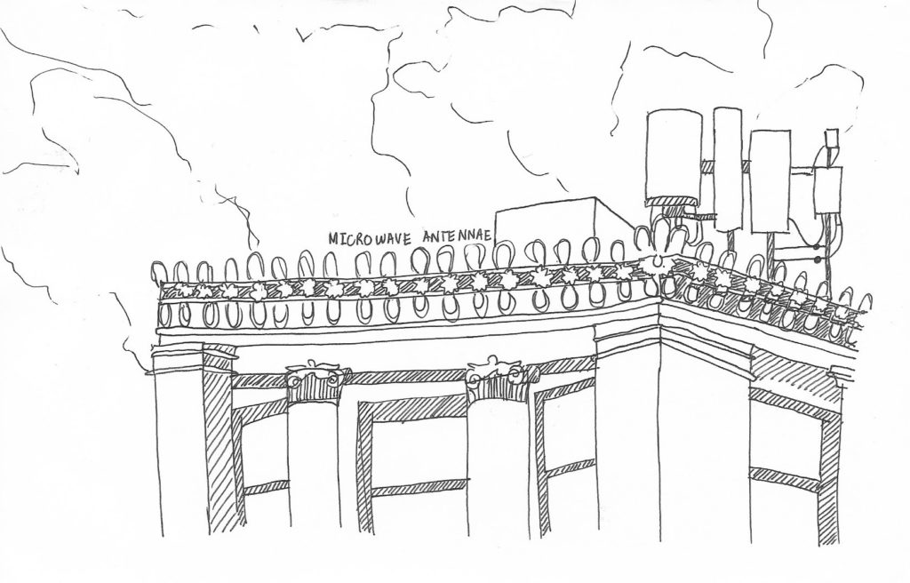
Before grabbing dinner with some friends in the East Village, I got some work done. While staring out the window of Parsons’ library, I recognized yet another piece of network infrastructure– the microwave antenna– affixed on the rooftop of another Parsons building across the street (5th Ave).

Microwave Antenna • Wireless internet service provider that provides broadband services through a network of antennae

I like the contrast between the clunky device that seems to be reaching up and out and the classical style, architectural building that seems to have been there for decades, standing still.

Badly designed machine

After trying—and failing—to find other people conspicuously struggling with a poorly designed object, I’ve found something that warrants this analysis: the machine in the lobby of my dorm that puts money on laundry cards. I’m not gonna pretend like I saw someone fighting with it and realized—just in time for this writing assignment—that it fit the bill. No, I’m writing about this piece of machinery because I know, from personal experience, that it’s really badly designed. 

In order to use the laundry machines in the basement, you need to pay with something called a Hercules Card, which you’re given at the start of the school year. These cards are refilled at the machine in the lobby, and the machine looks like this: 

The machine’s components have different affordances, and these seem functional enough. The two card slots that protrude from the machine afford card access and the two recessed card slots seem to be involved in some similarly card-related process. The number pad affords personal verification, presumably for something like a PIN number, and the four buttons toward the top of the machine afford interaction with the operating system. All of this seems fine on its own.

Enter the signifiers, and things break down. It’s unclear what each of the card slots is actually for, because the labels that usually signify which card goes where are either ambiguous or not there. Does the Amex/Mastercard/Visa label mean that the card slot directly above it is for payment method? Or do credit cards go into the card slot on the left, because aren’t credit cards sometimes called “smart cards”? No signifier indicates where the Hercules Card should go. And what on earth is that totally unlabelled card slot at the bottom-center of the machine? Is a third card going to come out of the machine that’ll later be “removed” on the right?

If I were to redesign this machine, I’d fix up the signifiers and label things clearly. That seems like an anticlimactic way to end this piece, but I don’t really see there being much more to it.

Vending Machine

Yesterday, I observed my roommate Michael use a vending machine on the first floor of our dorm. Michael was trying to get a chocolate chip cookie from the bottom row of the vending machine. The vending machine has a touch screen display that gives step by step instructions. The machine tells you to swipe your card or insert money to begin. So Michael swiped his card, since he didn’t have any cash on him. The vending machine takes a couple of seconds to load after you swipe. The vending machine automatically takes $2.50 out of your card. Then it tells you to press the code of the snack you want. The vending machine has a small keyboard below the display. So Michael entered the code for the chocolate chip cookie. The cookie is supposed to then dispense. When you are finished with the transaction, the vending machine tells you to select another item, or press “complete” on the card reader (you don’t need to do this if you pay by cash). If the thing you bought was less than $2.50, pressing complete means that the vending machine changes the charge. If you don’t press complete, the vending machine asks you to buy another item, to use the rest of the $2.50. Once you press complete, the machine also tells you “Thank you, and have a great day.” Then after about 15 seconds, the display returns to its home screen. If you don’t press complete, after about 40 seconds the machine moves to the “Thank you, have a great day” screen, and then back to the home screen.

Unfortunately, the cookie didn’t dispense. There is a spiral shaped piece of metal that holds the food in place. The plastic casing of the cookie got stuck on this piece, and the cookie didn’t dispense. While this is disappointing, it is probably unavoidable. Since it would be impossible to design a frictionless vending machine, there is always a possibility that the food will not make it out the vending machine. However, It would be nice if the vending machine could have a sensor or device to determine if the food was dispensed and made it to the receptacle, and refund you if the food doesn’t dispense. Also, while this is more of a cosmetic improvement, it might be nice if the machine had a loading screen, since it takes a while to load after you swipe your card. Even though the machine clearly tells you to press complete on the card reader, a lot of people don’t do this. This means someone else could use the remainder of the $2.50 you paid. Perhaps the vending machine could have a big sign on it telling you to make sure to press complete. Or it could automatically take the whole $2.50 if you don’t press complete or select another item within 40 seconds. This would use negative reinforcement to get people to press complete.

When their food is stuck in the vending machine, many people will try to shake the vending machine to get it out. As far as I know, I don’t think this actually works. I suppose this would be an affordance of the vending machine: it is too heavy for an average person to pick up or move much. The touch screen display affords the user the ability to manipulate the machine through touch. The keyboard that you use to enter the code for the item you want affords you the ability to press letters and numbers. There is also a money scanner for dollar bills, and a coin slot. The money scanner affords you the ability to insert dollars, and the coin slots affords you the ability to insert coins. The messages from the machine are signifiers, with the exception of the last message that tells you to have a nice day.

Observation – MAGNET doors

I’ve made some observations about an interface that everyone in this class has used: the MAGNET doors. There are some problems with the way they unlock both for people entering and leaving. If you’re entering, you have to tap your ID on the card reader to unlock the doors. However, the glass doors, which allow you to see inside, also make it so the card reader has to be farther away from the doors. Additionally, even if your card won’t open the door, the light on the reader still goes green, and in most people’s minds, green = go. The distance also means that if your card didn’t work, you have to walk a couple steps back to re-tap or, as many people do, just ask whoever’s at the desk to let you in so you can get to class.

Then, once class is over and you’re on your way out, there’s a proximity sensor and a button to unlock the doors. The sensor is supposed to automatically unlock the doors when someone approaches, but it’s aimed poorly and only detects you if you’re either very tall, waving at it, or walking straight at it from a distance. Given that most Magnet classrooms are around the corner from the door, most people don’t walk straight at the door, instead staying close to the wall, and in the sensor’s blind spot. Therefore, most people go for the button, which suffers from the same problem as the card reader on the other side: it has to be on the wall, so it can’t be within arm’s length from the door. A few people I’ve talked to didn’t even know the sensor was there and always went for the button. I only figured out about the sensor because my apartment building growing up had an automatic side-entrance door with a similar problem: it wouldn’t detect me unless I waved at the sensor to open the door. That one didn’t even have a button, and the door was HEAVY so good luck getting it open without the machine’s cooperation. If these doors are this much of a pain to get through for me I can only imagine how difficult it would be for someone in a wheelchair or someone with limited use of their arms or hands.

Observations

The Bobst Library Computer Center, at which I am employed, provides a variety of services, among which are large book scanners on every other floor of the library. Those scanners hold the first place in the ranking of things patrons complain the most about. These large machines are operated by a neighboring touchscreen, and those touchscreens are a menace. They are 20″, the screen itself is nearly unresponsive. Patrons have to put a lot of effort to push at the buttons, which is not accessible to people with limited mobility. And when we, the BLCC staff, go to the floor to look at the scanner, we have a hard time – the machines are heavy, the screens even heavier, and we have to punch in an excessive number of admin passwords and codes, which again is impeded by the size and the lack of sensitivity of the screen.

Finally, most patrons don’t even need to scan books anymore, as the number of people who use physical books in their research is getting smaller. The most that needs scanning these days are a couple loose pages of a signed document, which the smaller scanners on the first floor labs are perfectly suited for. It would make much sense to switch out at least half of the book scanners with smaller single pages scanners, and yet it seems unlikely to happen in the nearest future.

Elevator

Last night, I observed my friend operate the elevator of an apartment building in Chelsea. She and I had the goal of getting to the ground floor of the building, coming from the 5th floor. 

First she pressed on the button to ‘call’ the elevator car. Once we walked in the elevator, I noticed how she was already positioning herself to get out of the car (think about how people organize themselves in front of subway doors as the train approaches a station). To get to the 5th floor earlier that night, the guests had already had the surprise of using the building’s front-side elevator (90 degree exit) which I would say is a format that isn’t commonly found in buildings in the city. 

We encountered the elevator on the right (90 degree exit)

The first thing we noticed was that the interior had a wood-finish– doors, walls, ceiling, and floor. This design decision made the elevator feel warm and homey; however, it also made the elevator feel smaller than it actually was and darker because the wood didn’t absorb the ceiling lights very well. This caused her to survey all four sides of the car to see where the doors would open to the ground floor. While the affordance of controlled transport (of moving up and down) is provided by the control panel holding all the buttons, the affordance of entry and exit is provided by the opening and closing of doors. As for the two-sided, two-panel center parting elevator doors, the signifier would be the car’s sill line. 

Because elevator doors need not be manually opened or closed, there were no door handles extending from the surface. The dark interior and perceived tightness of the room confused my friend who was deciding which direction to face to prepare for a smooth exit onto the ground floor. It was only when the doors had actually opened (which did not take a long time from the 5th floor) that she was able to find the right side for exit. This frustrating experience could have been avoided if the designers had taken into consideration the users’ mental model of the typical (one-sided) elevator and anticipated the users’ unfamiliarity with this kind. They could have made the necessary adjustments to the interior design of the car (which would’ve made the sill line more obvious and visible) and maybe even install an additional guide (blinking lights) to signal which set of doors to exit through.